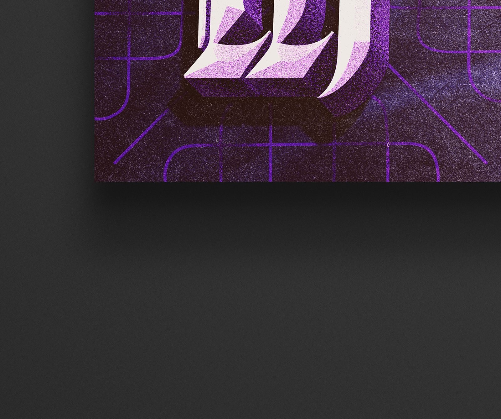
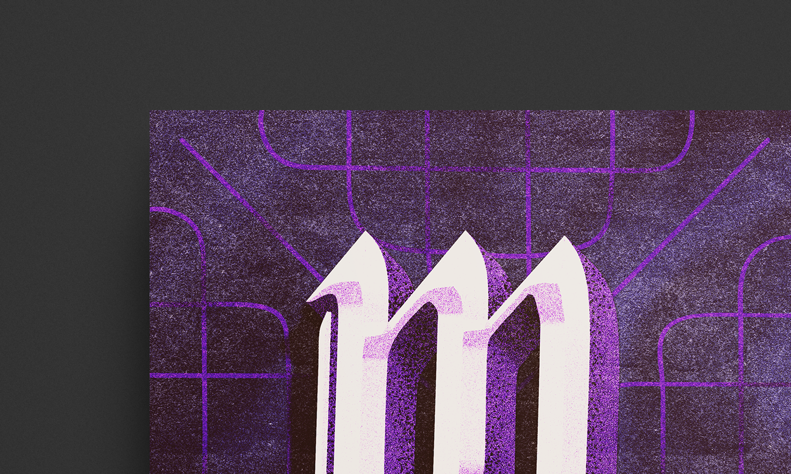
Title treatment & Key Art concept development for the TV series of Nicôle Lecky’s play ‘Superhoe’
Client
BBC
Partner / Agency
BBC Studios
Role
Art Direction
Type & Lettering
Key Art
Context
Nicôle Lecky's one-woman play Superhoe — a raw, funny portrait of a young woman caught between musical ambition and the pull of online sex work — was being adapted into a BBC Three series. We were brought on to develop key art and a title treatment for the show ahead of production.
Challenge
The title itself was the creative territory. Superhoe is provocative by design — it's meant to challenge, not comfort. The artwork needed to own that boldness rather than soften it, while still working as a piece of broadcast key art across digital and print.
Solution
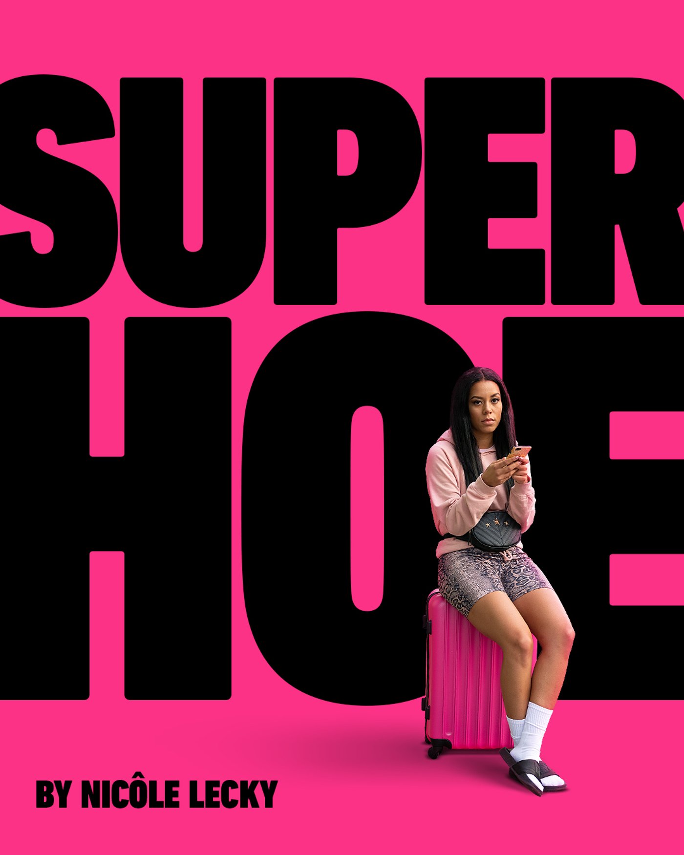
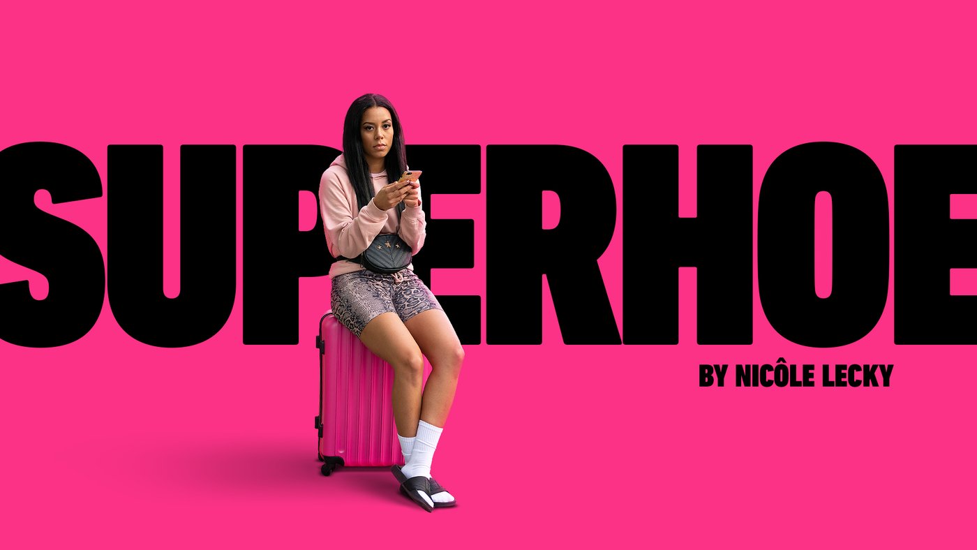
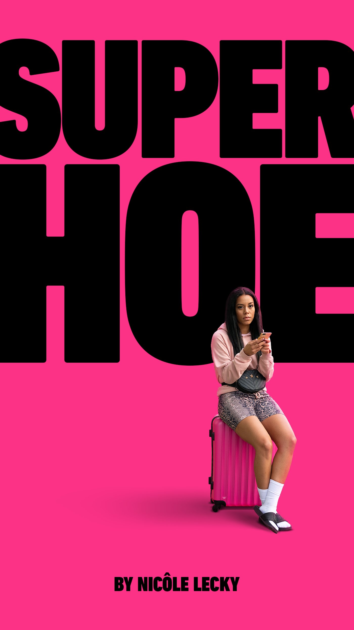
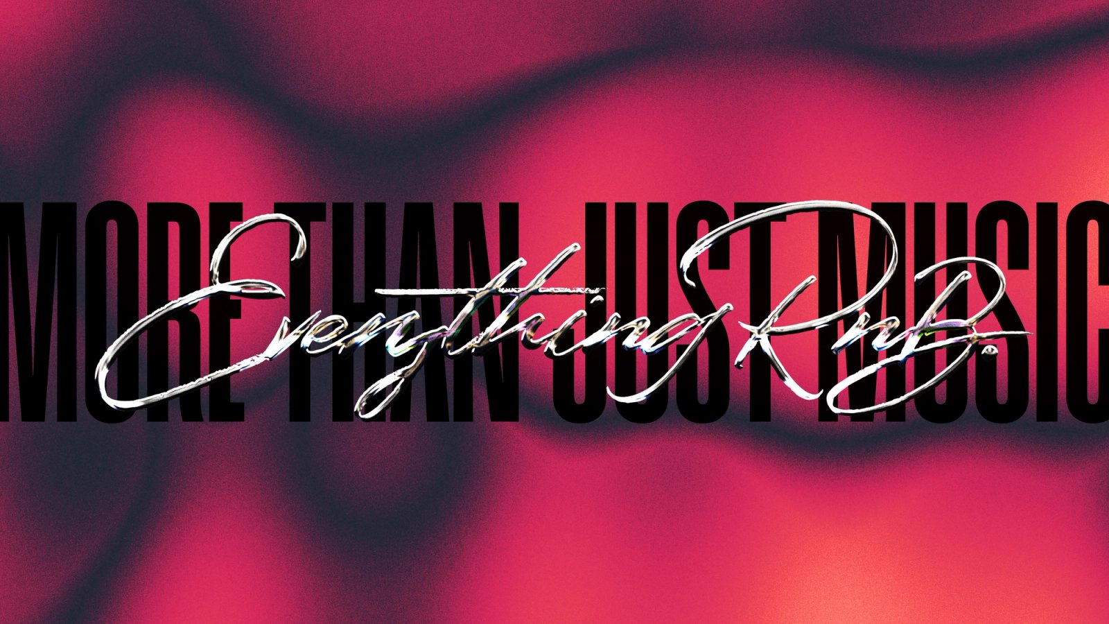
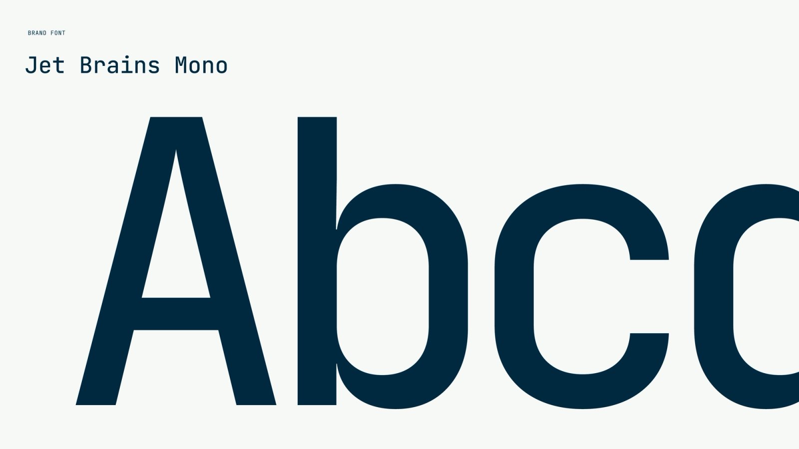
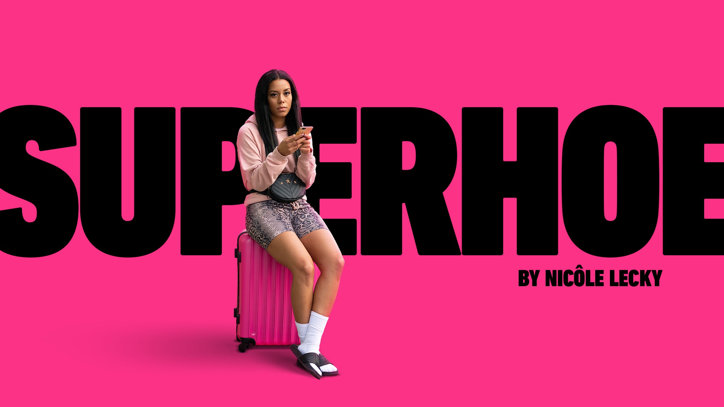
Taking cues from the original play's cover image — Lecky sat on a pink suitcase, phone in hand — we built a concept around oversized black sans-serif lettering on a hot pink ground, with the title deliberately cropping beyond the frame. The scale was the point: too big to ignore, too bold to look away from.
The series was ultimately renamed Mood ahead of broadcast, so this remained a concept — but it stands as a clear proof of how simple art direction and bold typography can carry a provocative idea without flinching.