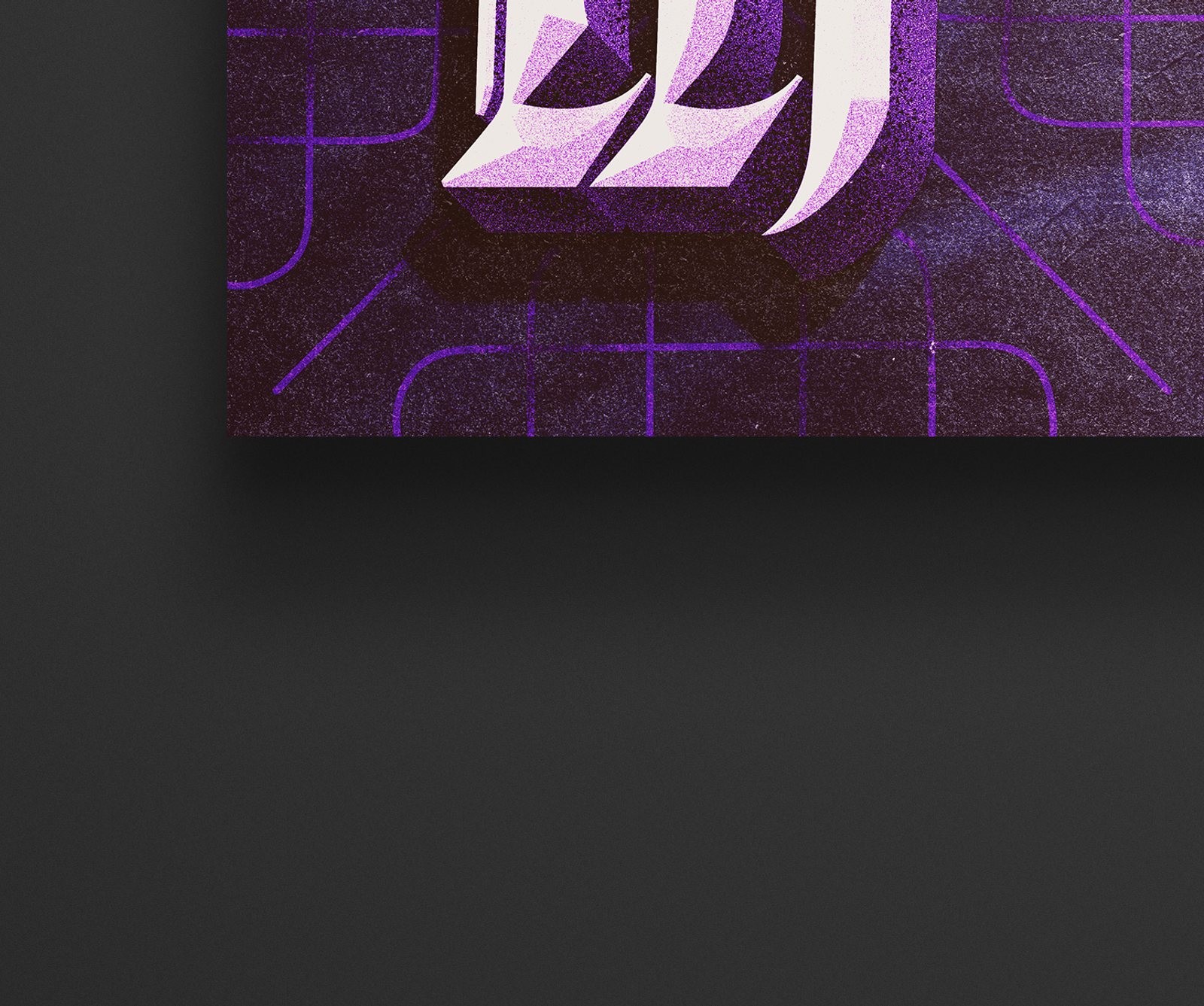
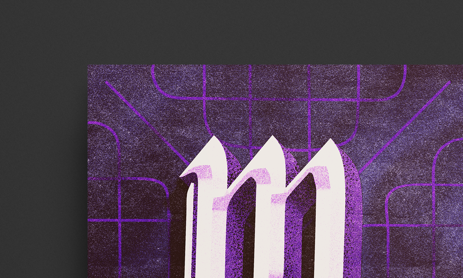
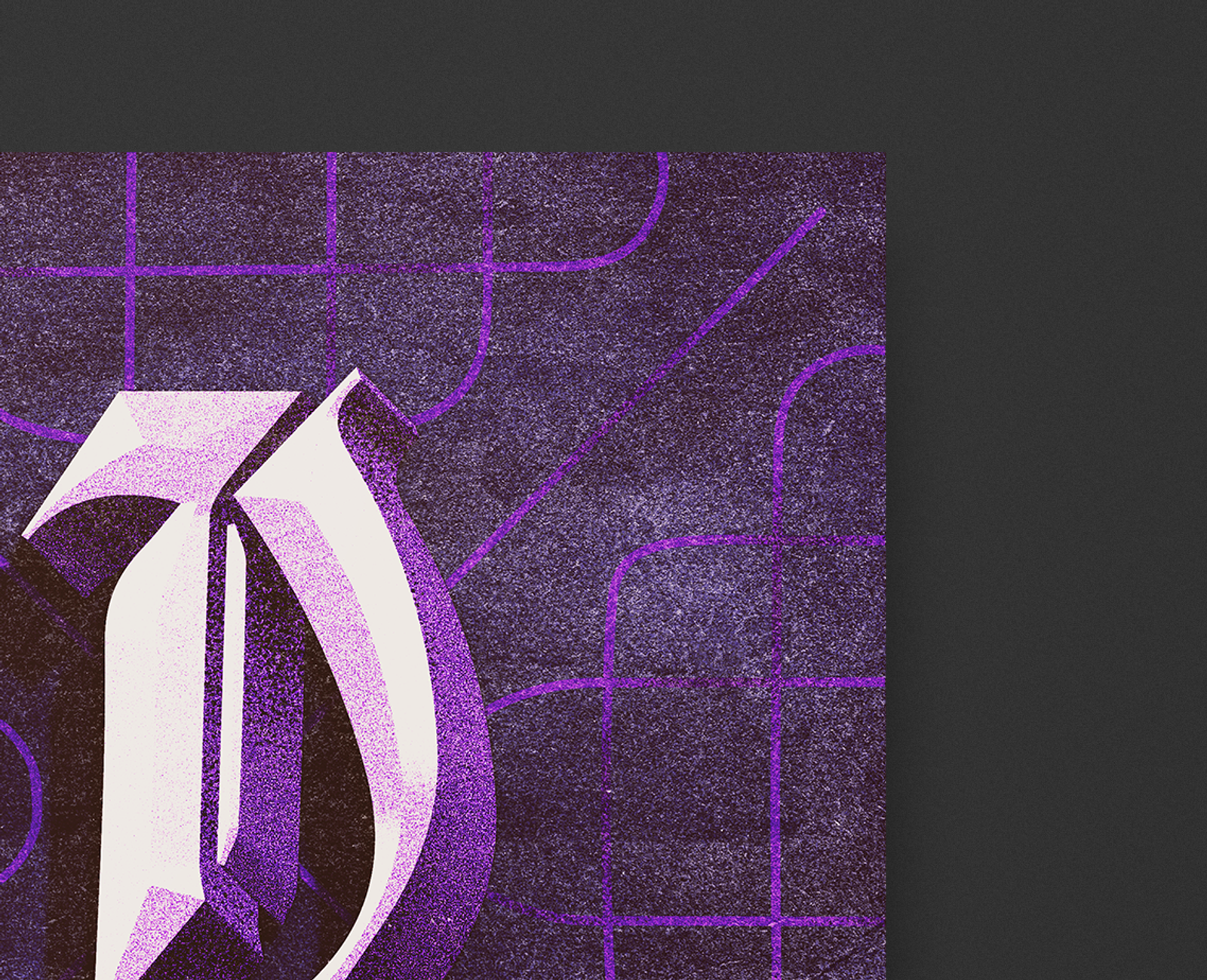
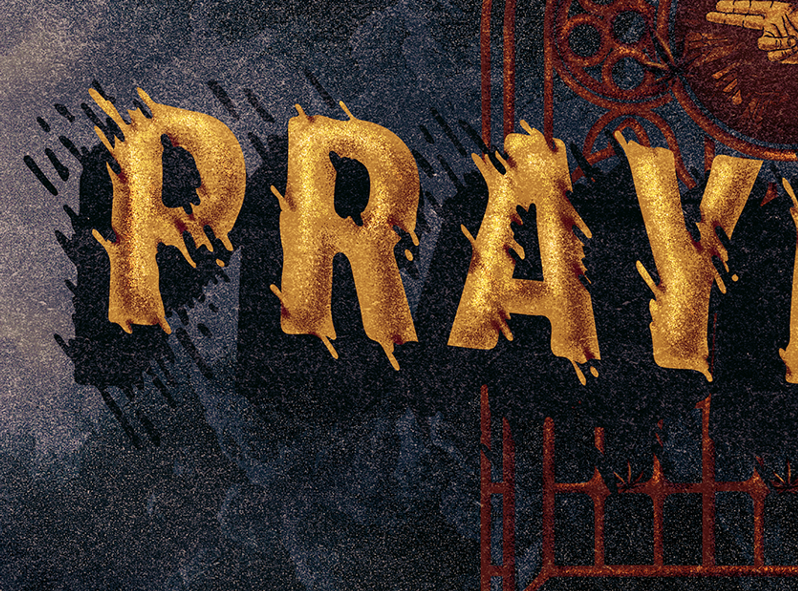
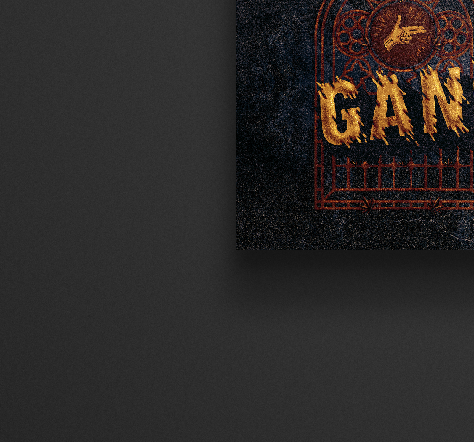
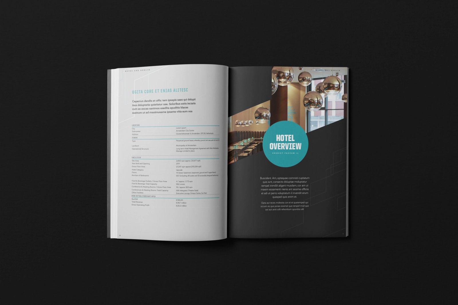
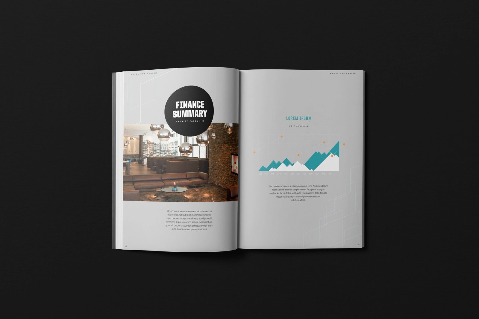
Title treatment for a documentary about the creative process of Oscar-winning film composer Hans Zimmer
Client
BBC
Partner / Agency
BBC Studios
Role
Type & Lettering
Key Art
Context
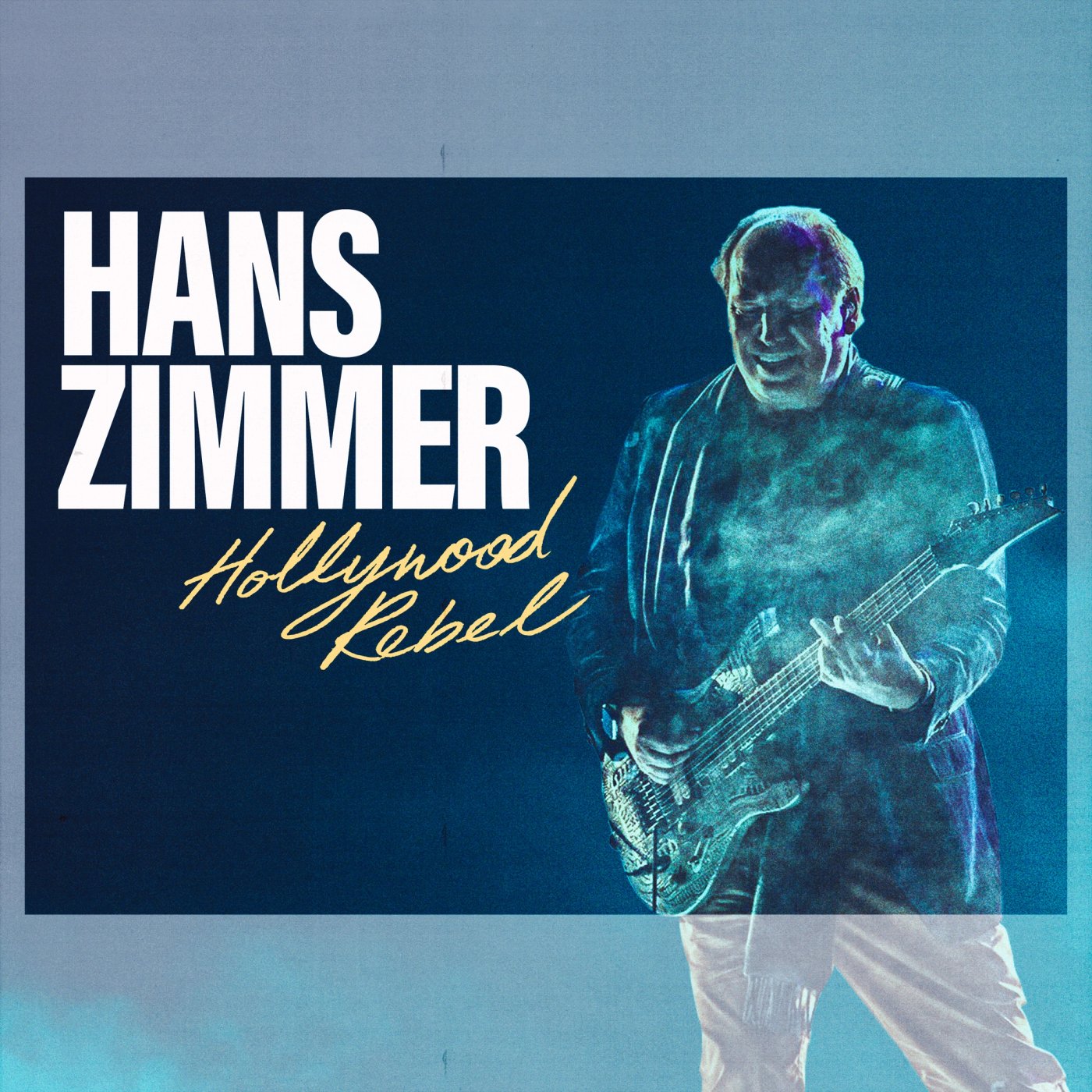
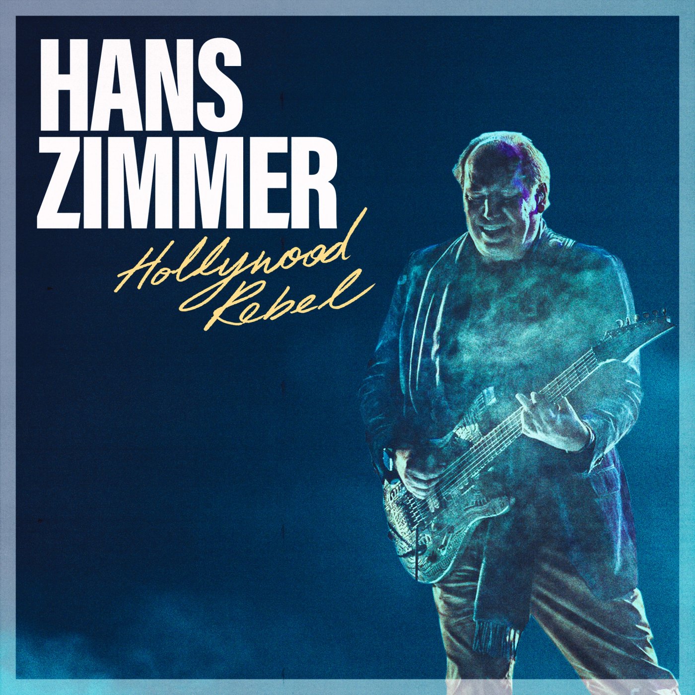
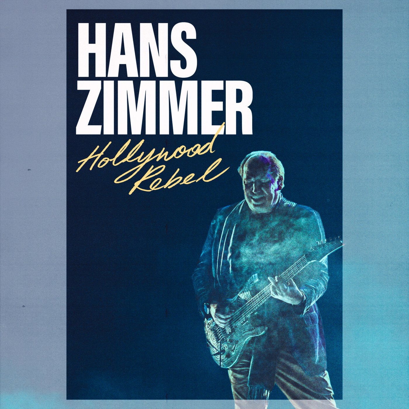
!TS was commissioned to create the title treatment and key art for Hans Zimmer: Hollywood Rebel — a documentary portrait of one of the most recognised names in film composition, originally produced for the BBC and since picked up by Netflix and Prime Video.
Challenge
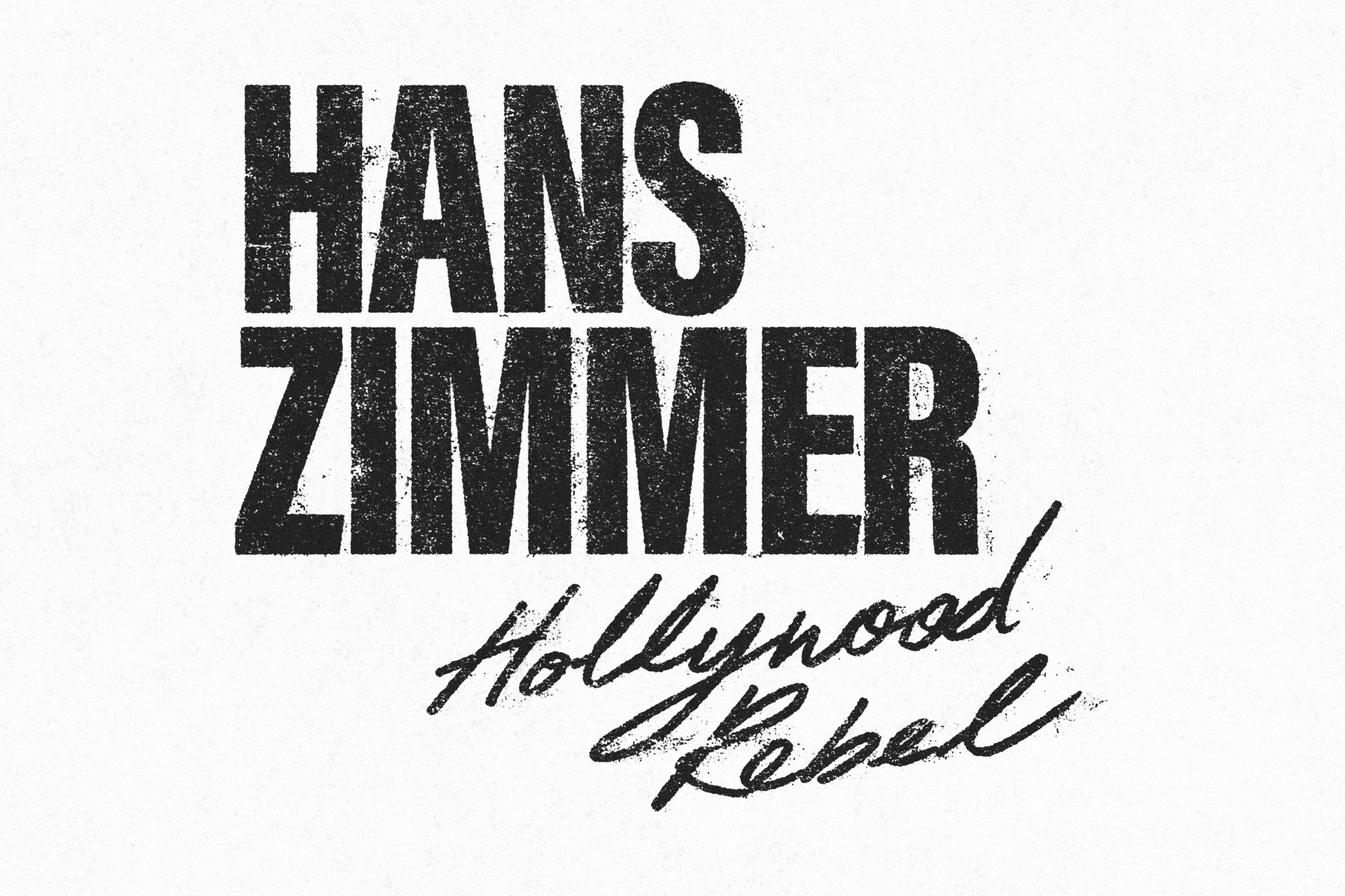
The typography needed to communicate two ideas — the stature of a composer whose name carries huge cultural weight, and the rebellious, unconventional mindset that's defined how he works. The title treatment had to feel both authoritative and handmade, without either side undermining the other.
Solution
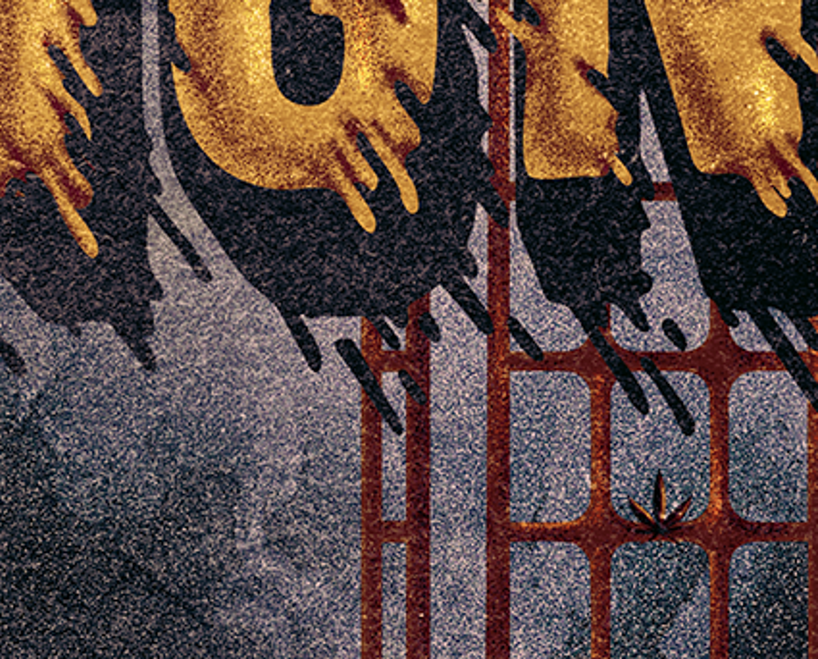
We paired a bold, traditional typeface for his name with intentionally rough hand-drawn lettering — crafted to feel as though Zimmer himself had scrawled it. The balance was deliberate: too polished and it loses the rebellion, too loose and it loses the gravitas. The result sits alongside a still from the documentary, chosen to reinforce that same duality of a world-famous composer who's never played by the rules.